March 12, 2024
Responsive Web Design on Squarespace: A Practical Guide
More than half of all web traffic now comes from phones, and Google indexes the mobile version of your site first. So "looks fine on desktop" isn't good enough anymore: your site has to look great and load fast on every screen. That's what responsive web design delivers, a layout that adapts cleanly to desktops, laptops, tablets and phones.
The good news if you're on Squarespace: responsiveness is built in. The work is in doing it well. Here's how.
Why Squarespace works for responsive design
Every Squarespace template is responsive out of the box, your layout adjusts to different screen sizes automatically, no extra code or plugins required. Combined with customizable templates and a drag-and-drop editor, it's a fast way to get a clean, mobile-friendly site live. The flip side is less control over the details; when you need pixel-level design, custom animation or peak performance, a custom-built site gives you the full toolbox. For most small businesses, though, a well-set-up Squarespace site does the job.
Tips for a genuinely responsive Squarespace site
Pick a strong, mobile-first template
All templates are mobile-friendly, but some handle small screens more gracefully than others. Choose one with a clean, streamlined layout that's easy to navigate with a thumb.
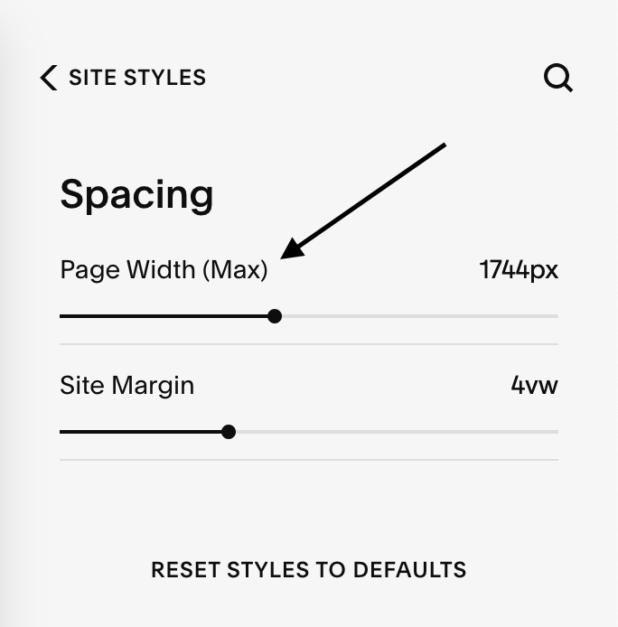
Set a sensible max site width
Set your maximum site width so the design holds up on large monitors without forcing huge images. On Squarespace 7.0, it's under Design → Site Styles; on 7.1, under Design → Spacing. Keep it generous but reasonable, going ultra-wide means heavier images and slower loads, so balance width against performance.
Optimize every image
Images are usually what slows a mobile site down, and speed is a ranking and Core Web Vitals factor. Compress them with a tool like Squoosh before uploading, keep banner images around 2000px wide, and don't ship 4K images to phones. Fast-loading images keep both visitors and search engines happy.
Use readable, mobile-friendly type
Text that's tiny or cramped on a phone drives people away. Choose legible fonts and font sizes that read comfortably on small screens. (For pairings, FontJoy is a handy starting point.)
Simplify the design
Clutter that works on a wide monitor overwhelms a phone. Lean on white space, keep layouts focused, and cut anything that doesn't earn its place. A simpler design is easier to use everywhere.
Preview on real screen sizes
Use Squarespace's preview to check desktop, tablet and mobile before you publish, then fix anything that breaks. Better yet, open the live page on your own phone.
The bottom line
Responsive design isn't optional, it's the baseline for being found and trusted online. Squarespace makes it achievable, and a careful setup, fast images, readable type, a clean layout, turns "responsive by default" into a site that genuinely performs.
If you'd rather have it built and optimized for you, take a look at our website design service, or book a strategy call and we'll talk through what your site needs.